Better Tech · Website directions
Ten ways to build Better Tech.
Ten complete sites for the same business, from the same facts and the same field photos. The three newest come first, followed by the first version, kept as it was, and the six directions after it. Each one has its own art direction, layout, motion and type, and each runs as a full site with a work gallery and a working enquiry path. Open them side by side and pick one.
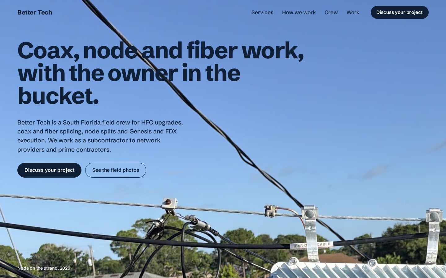
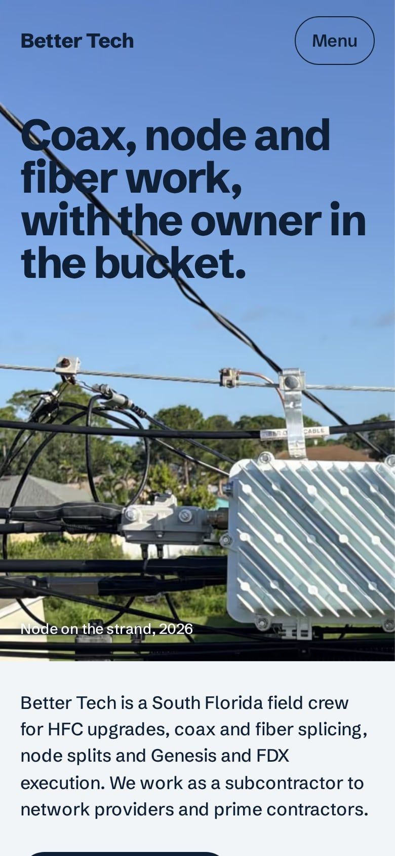
Daylight, open sky, the view from the bucket.
Overhead
The first view is the South Florida sky above the strand, photographed from the bucket, with the headline set in the sky itself; the view rises into place on load the way a bucket does. Below it the page stays in daylight: the four services become tabs with one photo stage that wipes open on each choice, the owner's own line from his reel sits on a band of that same sky blue, and every "Ask about" link preselects the work type in the enquiry form. The work page packs every field photo into one filterable grid with a step-through viewer. One grotesk throughout and one navy ink.
The view from the bucket.
Aloft Amber
Cool daylight and deep pine. The opening photograph is the strand and storage loop seen from the bucket, and it rises open on load the way the view does when the boom goes up. The services are a scope picker: choose fiber, Genesis and FDX, HFC or low voltage, see its photo and scope, and the enquiry form arrives with that work type already chosen. The crew sits on dark pine beside the night shift, and the work page filters the field photos by kind with a keyboard-driven viewer. One typeface, Schibsted Grotesk, and one amber signal for the actions.
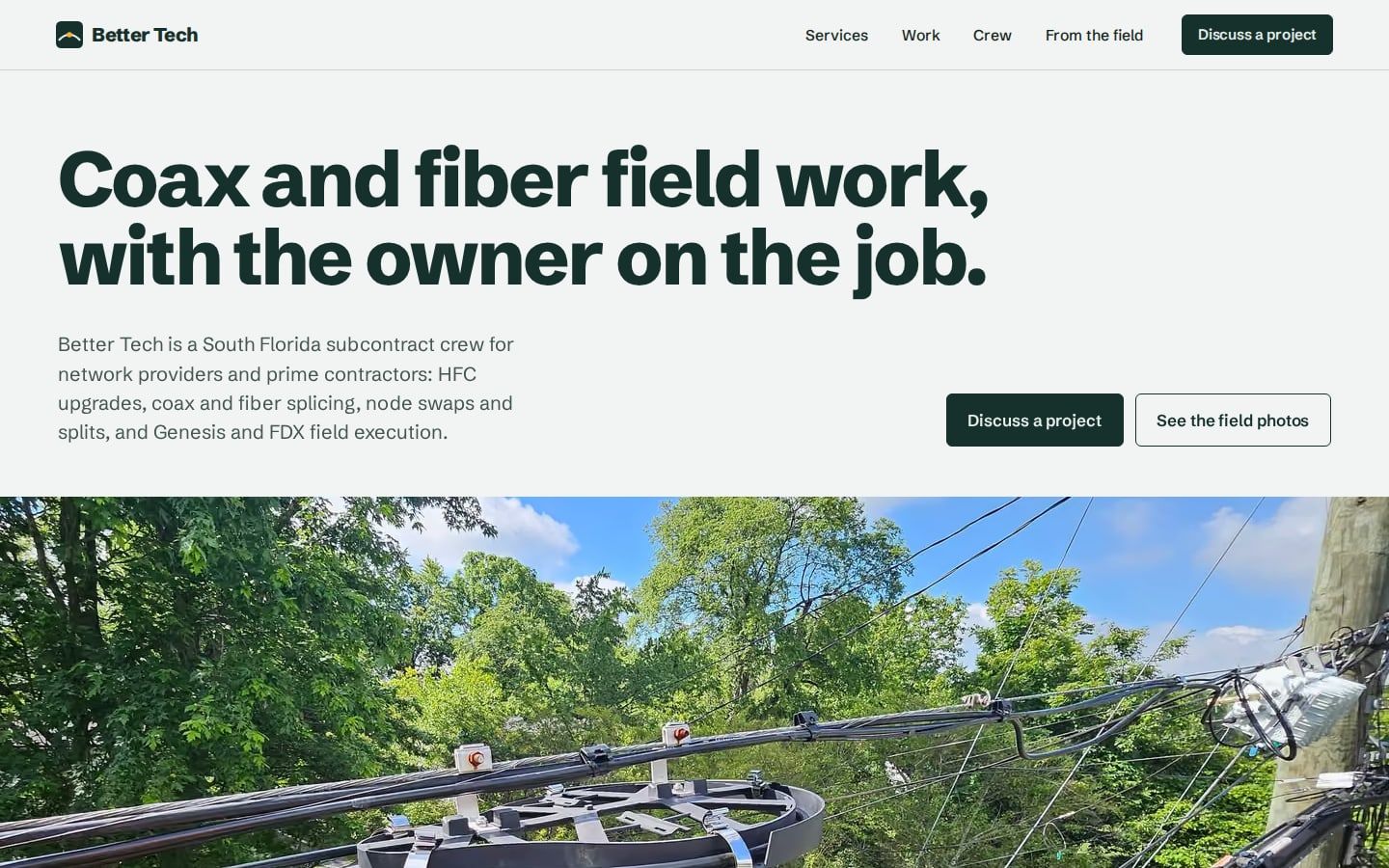
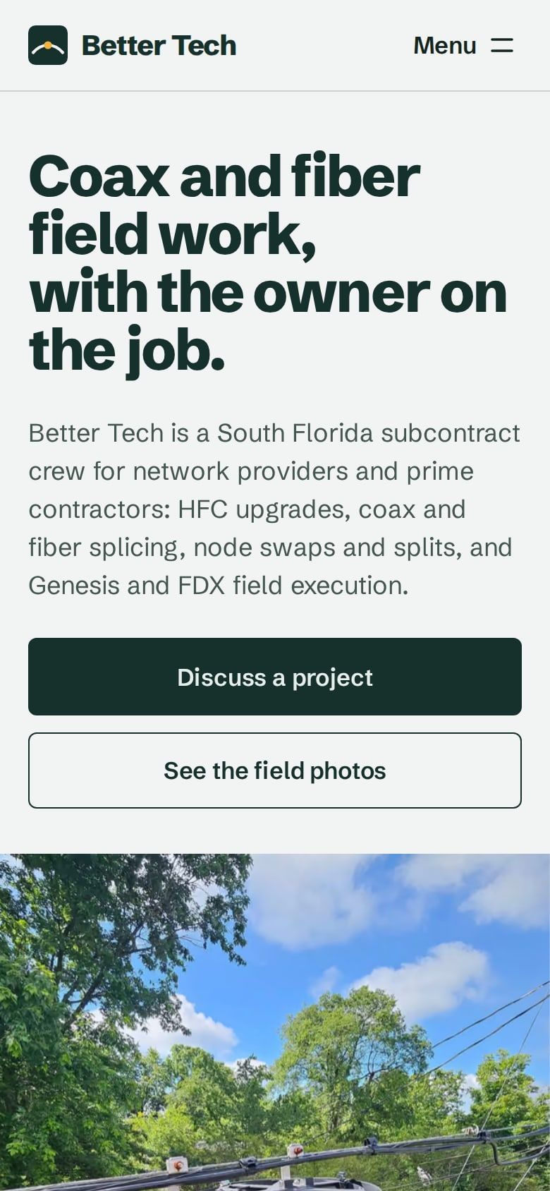
The view from the bucket, then down the pole.
Aloft Blue
Opens on the photograph taken from the bucket: the strand, a fiber storage loop and the Florida tree canopy, rising into place as the page loads and drifting upward as you scroll. Below it the services run in the order the work sits on the plant, from the node on the strand down to the backboard inside the building, each with a link that starts an enquiry for that kind of job. Daylight haze ground, one grotesk throughout, line blue for actions and a canopy green band for the owner, the crew and the enquiry. The work page filters by kind of work and opens a keyboard-driven photo viewer.
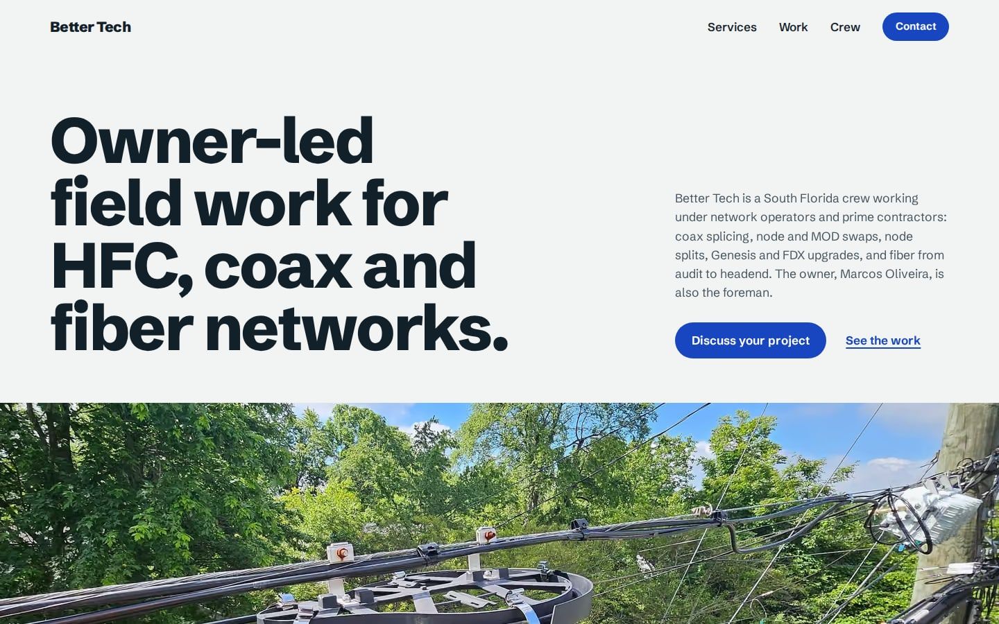
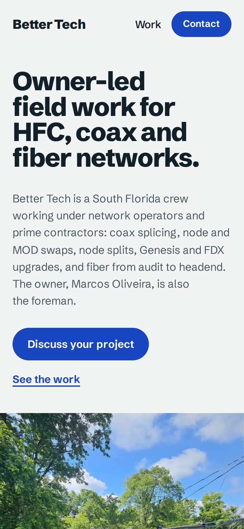
The first version. Paper, dark plates, fiber orange.
First
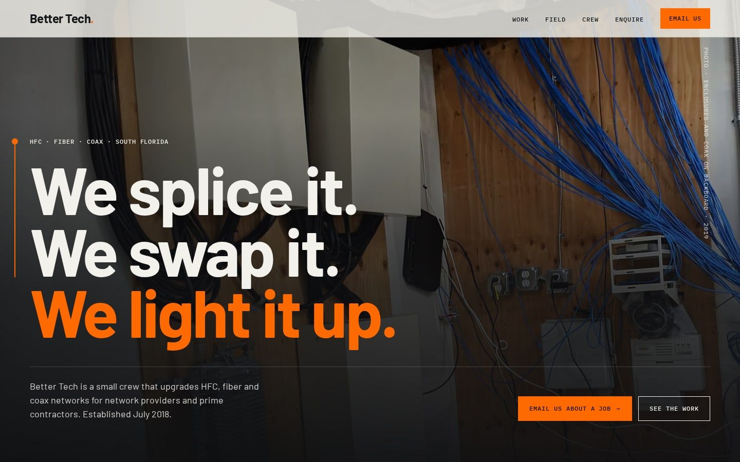
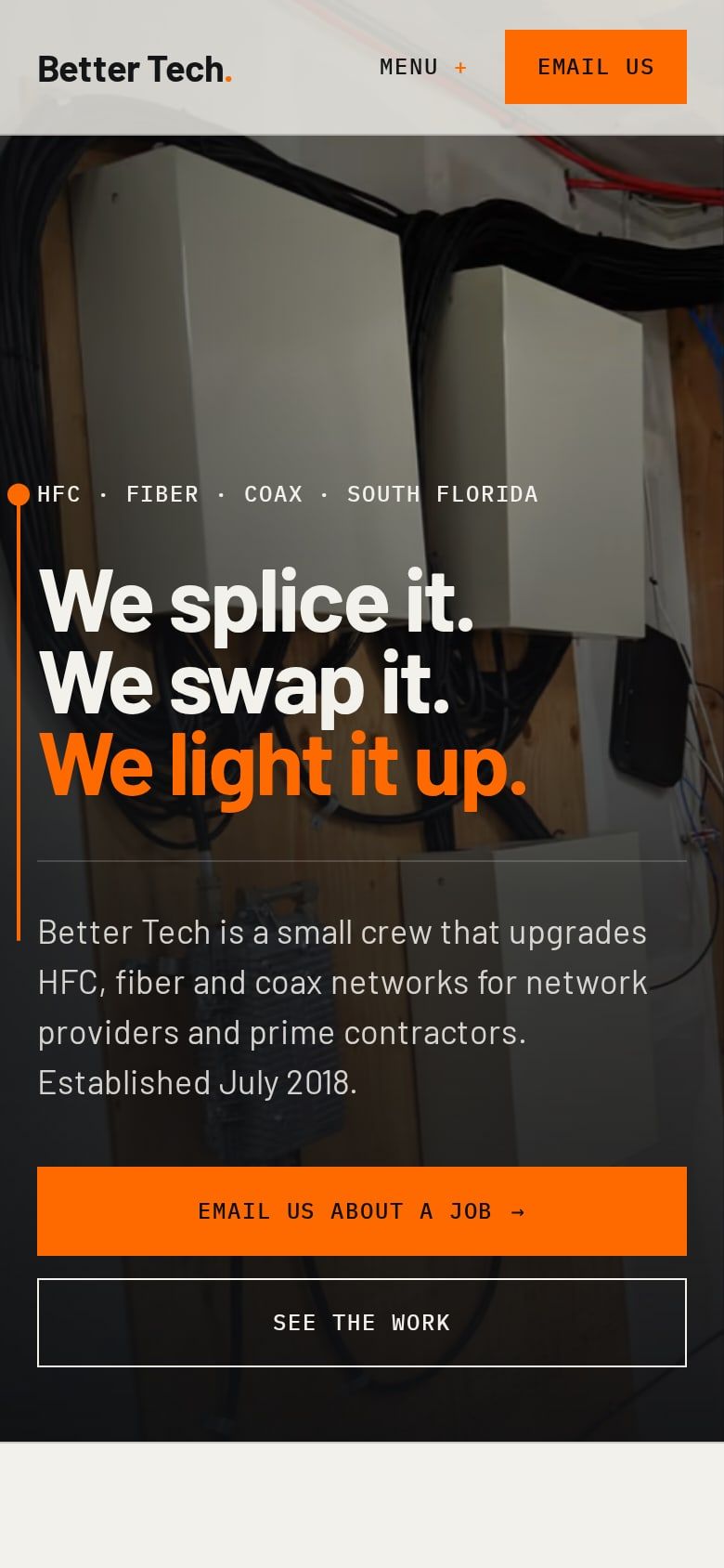
The first site built for Better Tech, kept exactly as it shipped. An as-built drawing as a website: a paper ground, near-black photo plates, a fiber-orange trace that draws down the page and lights a node at each section, numbered sections, and the backboard photo as the hero. Barlow headlines, IBM Plex Mono labels. Nothing in it has been restyled.
The instrument. Dark, exact, read off the splicer.
Meter
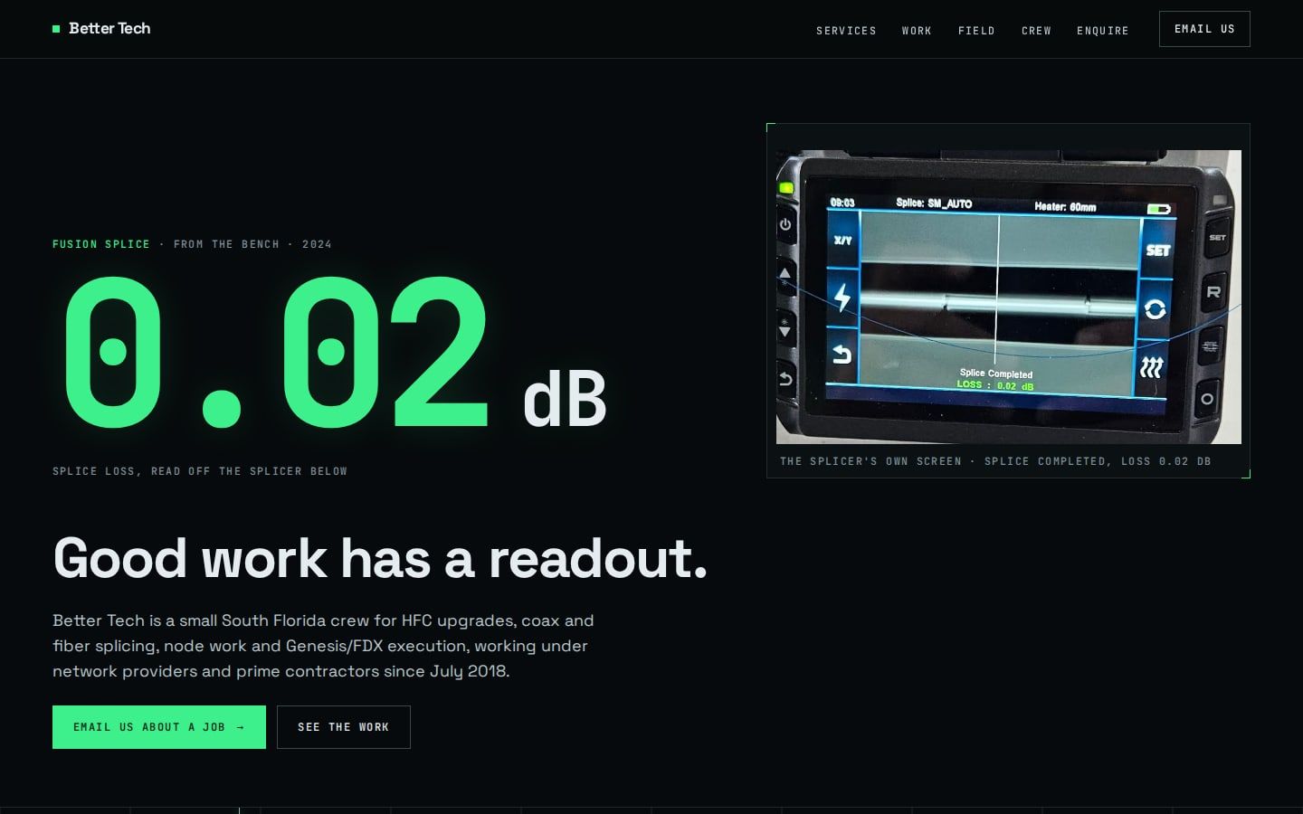
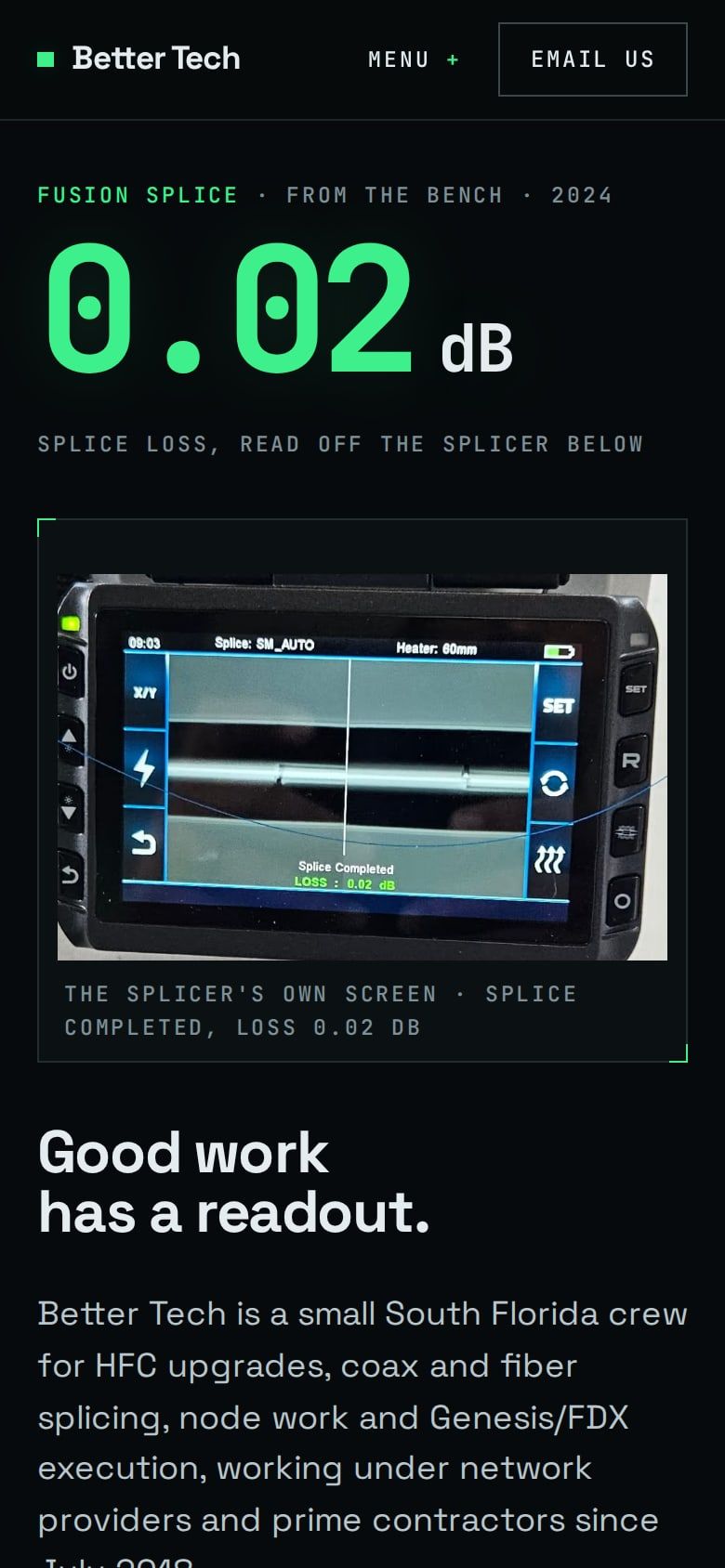
The hero is a real number from a real screen: the fusion splicer in the company albums reading a completed splice at 0.02 dB. Everything else follows the register of the test equipment a crew carries: a near-black ground, phosphor-green readouts, hairline panels with corner ticks, a drawn spectrum trace, and photos that sit in monochrome until they lock into colour as you scroll.
The plant map. White, wide, hi-vis, headend to wall.
Strand
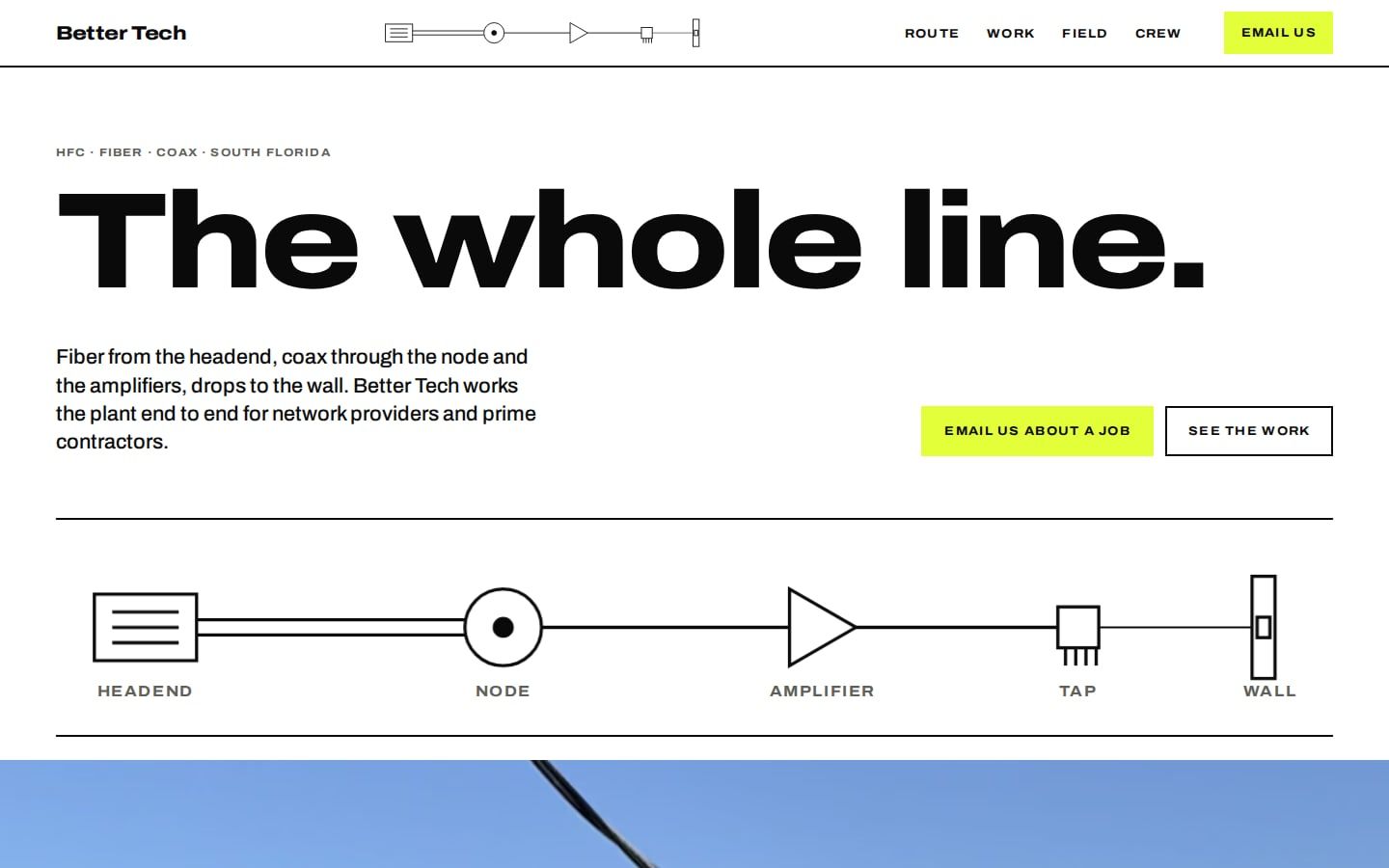
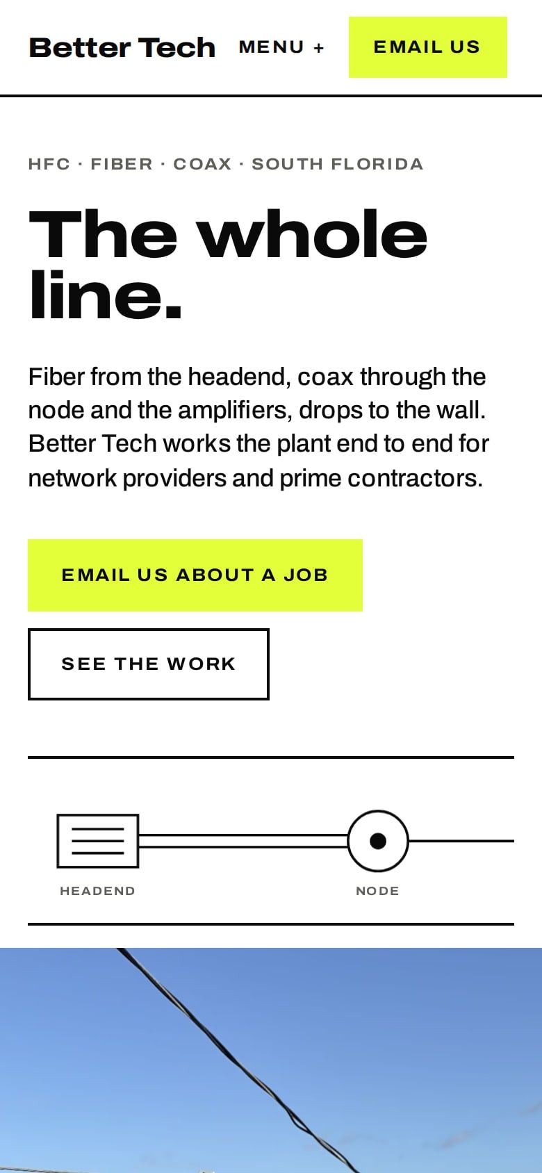
Built around the schematic a design map uses: headend, node, amplifier, tap, wall. The drawing sits in the hero and, in miniature, in the header, where it lights up the symbol for the service you are reading. Wide black grotesk type, white ground, and hi-vis yellow for captions and calls to action, the one colour every crew already wears.
The editorial. Cool white, serif, twelve fibers into one splice.
Bench
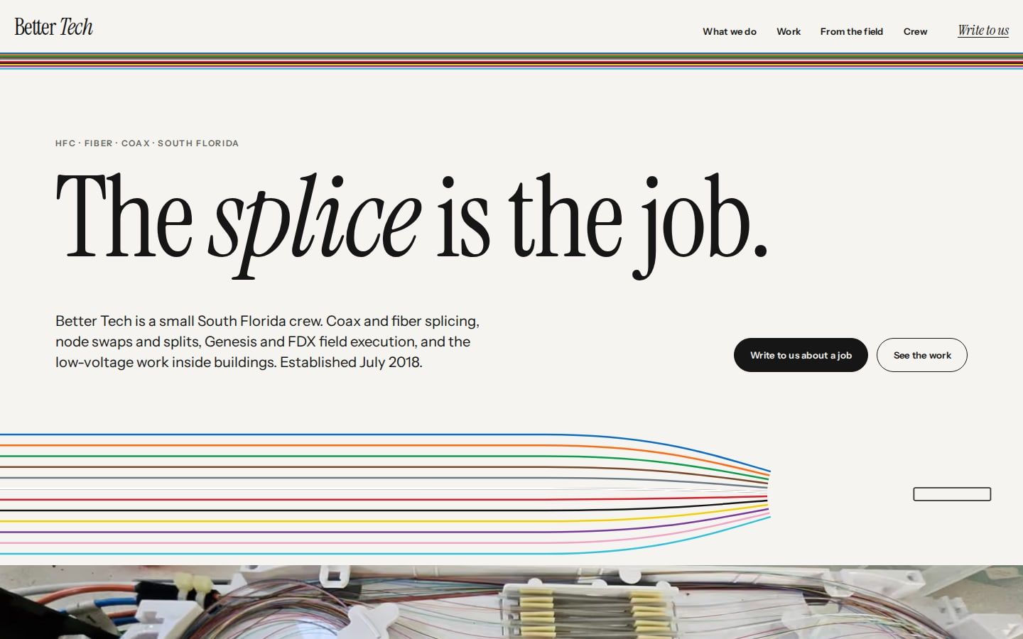
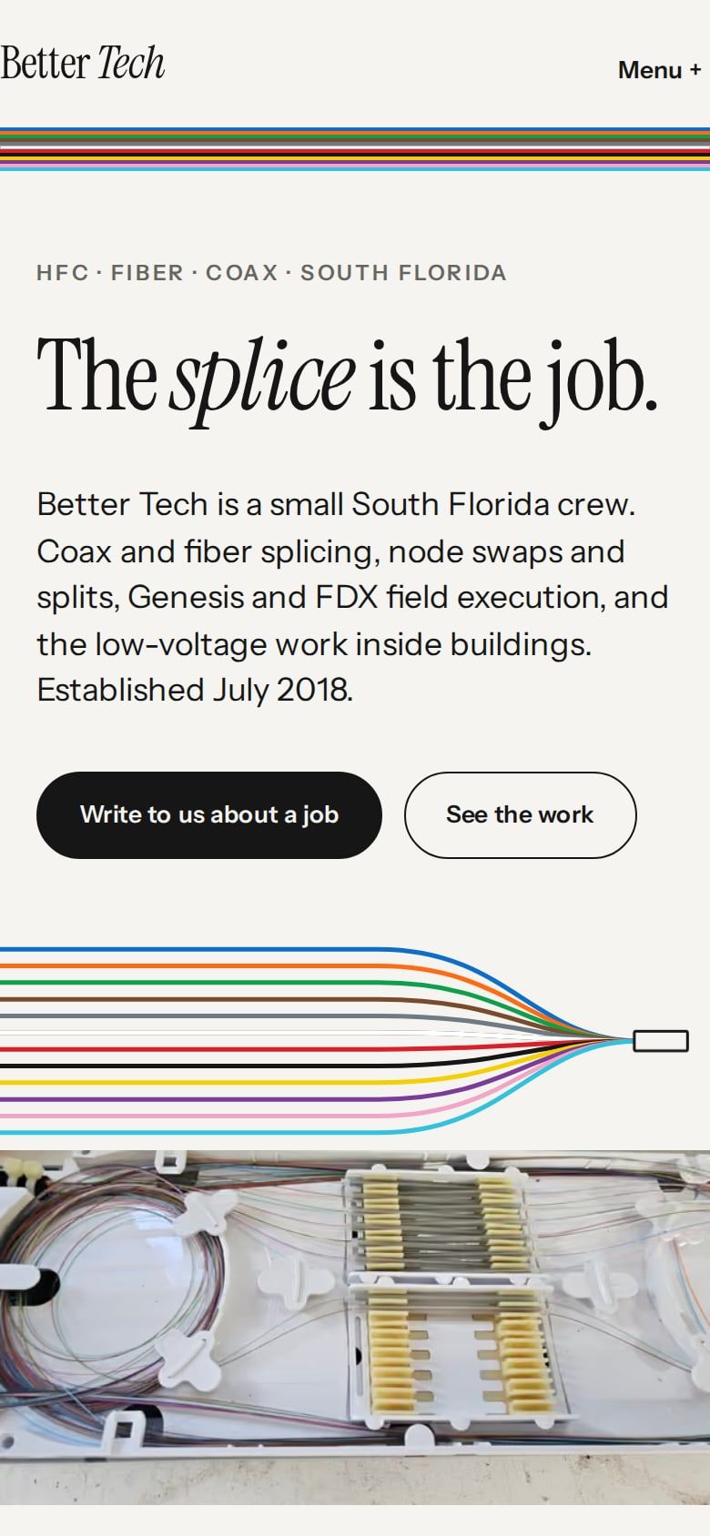
The quietest of the three and the most magazine-like. A serif headline, the twelve-fiber colour code drawn as a ribbon that runs through the page and converges into a single splice, and the splice-tray photo as a full-width band. Each section takes its marker from the next fiber in tray order. The owner's own words become the pull quote.
A crew’s shift in full-bleed photographs and very large type.
Shift
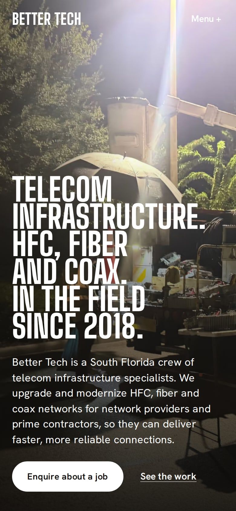
A cinematic documentary register on a warm near-black ground. Big Shoulders Display carries every headline at poster scale and Hanken Grotesk does the reading. The photographs are the only colour on the page: a night frame under the bucket light opens the site, then the four services arrive as full-height photo chapters that slide over one another as you scroll. Nothing is drawn or annotated and there is no accent colour: the button is white and links underline in white.

One ultramarine field, cream type, photographs as framed plates.
Plant
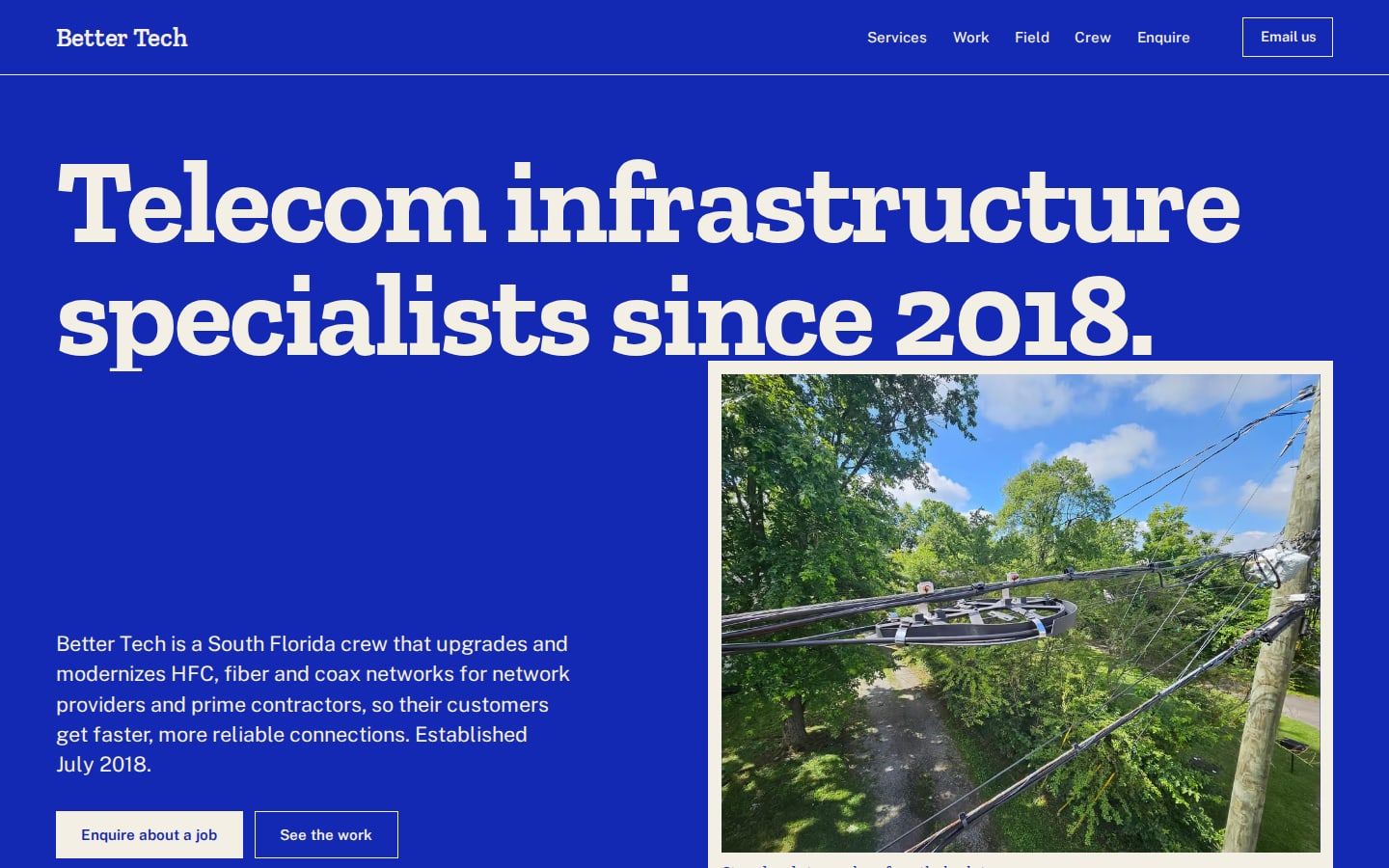
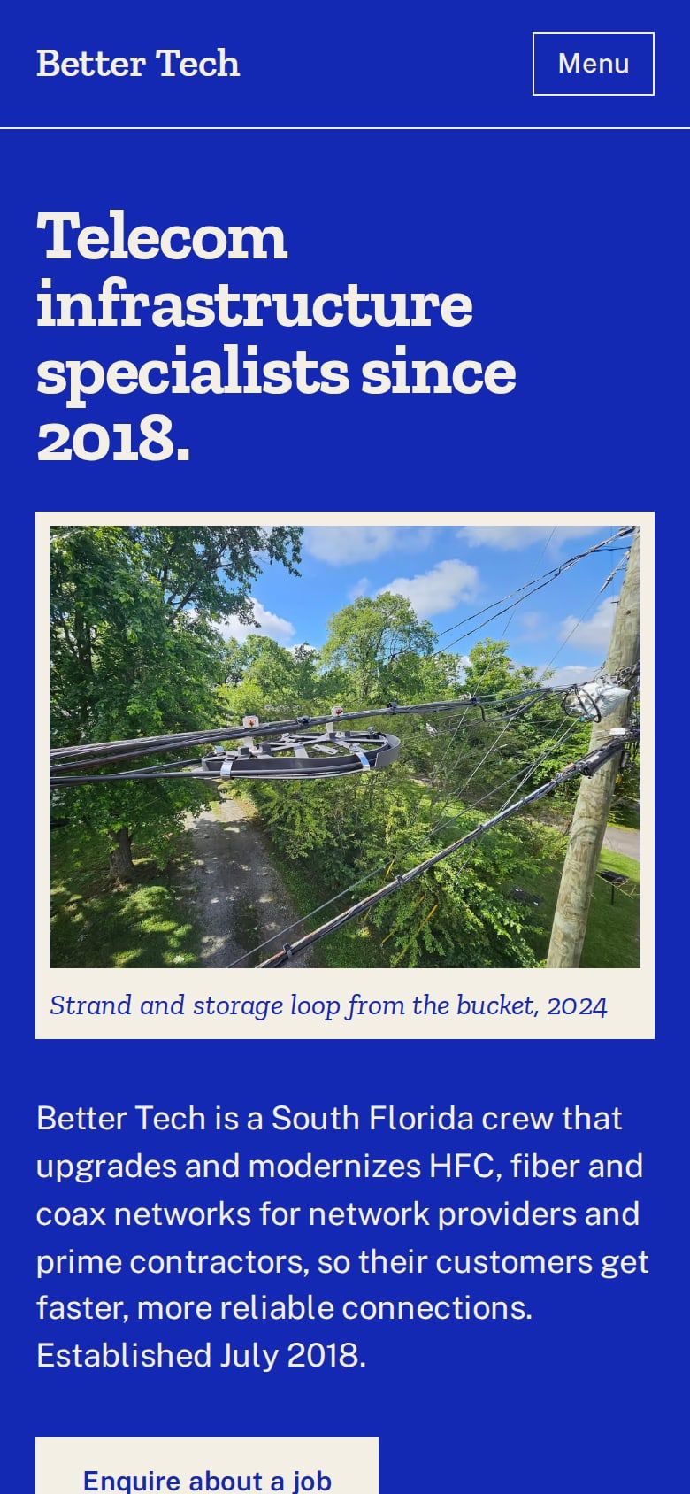
The whole site sits on one saturated ultramarine field. Type, hairlines, frames and buttons are cream; the photographs are the only other colour, each set inside a cream mat like a plate in a printed poster. A poster-scale slab headline opens the page, services run as a ruled list with slab titles and two-column text, and the Work band is the single inversion: cream ground, ultramarine type. Motion is two moments only: the headline wipes in on load, and every plate opens from inside its frame as you scroll.
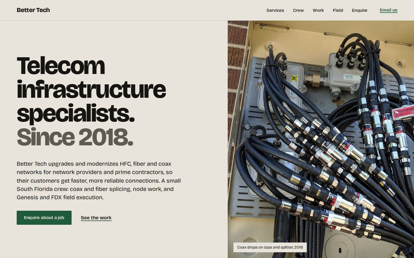
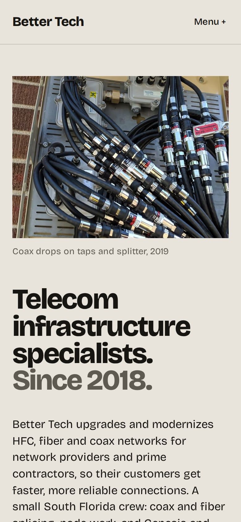
The photographs answer the text.
Span
A warm split screen on stone. On desktop a full-height photograph stays pinned on the right while the copy scrolls on the left, and it cross-fades to the picture that belongs to the section in view: the coax macro for the opening statement, the splice tray for fiber, the amplifier for HFC, the night shift for the crew. The work runs as a horizontal strip you can arrow through. One typeface throughout and one deep cabinet green for the button, the links and the strip controls.